
19 Nov 2018
Defining the Design System Principles for Safetycultures Spotlight app
As our platform (both Mobile and Web) scales daily with growing customer needs and more teams working across the company, maintaining consistency in our customer experience, particularly in interface and interaction design, becomes increasingly challenging.
To address this, I launched an initiative aimed at ensuring a consistent experience across mobile and web platforms by creating a Design System. I conducted a series of workshops and sessions involving key stakeholders from different platforms to achieve the following goals.
The Five Key Principles
Through our collaborative efforts, we have identified five guiding principles for our Design System. Here’s how we arrived at these principles:
1. Platform Agnostic/Consistent
Users should not need to re-learn how to use the product when switching between different platforms, whether it's mobile, tablet, or web.
2. Design for Scalability
Always consider scalability across devices when designing new components, particularly between mobile and web.
3. Collaboration
Design should reflect real people using the product. For instance, instead of just showing a person’s name, use their profile photo or grouped avatars for teams.
4. Simplify
Reduce cognitive load and make it easier for users to perform actions or make decisions.
5. Be Flexible
Keep in mind that things change over time, so design for customizability. Ensure that UI components can adapt, such as when a button inside a component changes.
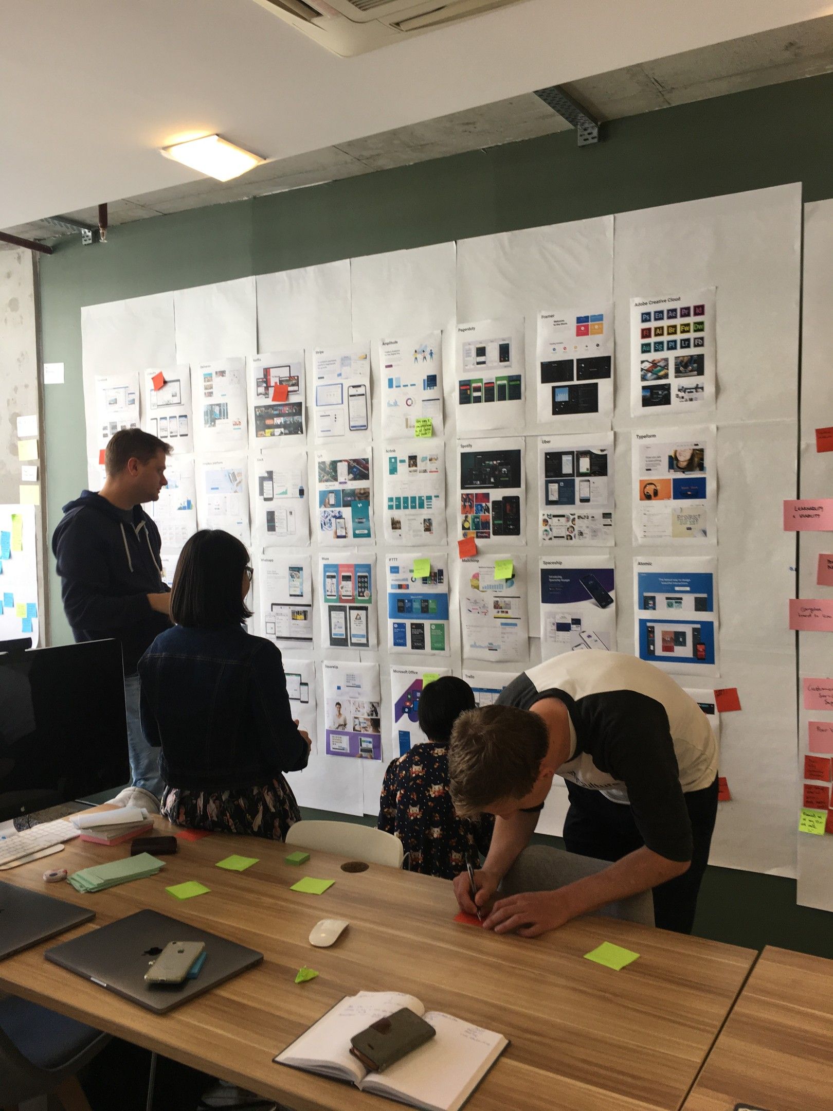
Workshop Exercise: Design Fit Exercise
I will be posting various software product screens on the Journey Room (Library) wall and conducting the following activities:
Identify five products you like and explain why.
Identify five products we want to avoid.
This workshop aims to provide a shared understanding of our product design philosophy and help us establish our Design Principles.
Participants (23)


Outcomes
After each participant described what they liked and disliked about the products, we grouped the results to find commonalities. Here are the most frequent responses:
Things We Like
25: Easy learning curve for beginners to advanced users
14: Great interaction/flow
19: Contextual and relevant information
15: Cross-platform consistency and synchronicity
14: Visually appealing
9: Strong brand identity
9: Strong community and support

Things We Want to Avoid
14: Poor visual design
9: Complex/hard to use
8: Poor learnability and usability
7: Noise and clutter
7: Poor navigation

👍 Products with a Lot of Positive Feedback
Airbnb (14)
Relevant content at the right time, Easy and simple to use
Slack (7)
Consistency in all platforms
Trello (7)
Google Suites (6)
Consistency in all of its apps, Interconnected
Uber, Netflix, Intercom, Medium (4)
🙅♀️ Products with a Lot of Negative Feedback
Atlassian (9)
Hard to find stuff, confusing, overwhelming
Github (5)
Not engaging, too many features
Facebook (5)
LinkedIn (4)
PagerDuty (3)
No positive reinforcements, Sad and depressing
Our initiative to develop a Design System is driven by the need for consistency across our mobile and web platforms. By identifying five key principles we aim to create a robust and scalable system. Through workshops and collaborative sessions, we have gathered valuable feedback on what works and what doesn't in product design. Positive feedback highlighted products like Airbnb and Slack for their ease of use and consistency, while negative feedback pointed out issues in products like Github, emphasising the importance of clear, user-friendly design.